UX CASE STUDY
User Research for
Cooking Tutorial Website
Overview
THE PRODUCT
What’s Cooking? is a cooking tutorial content provider and website. They aim to provide a variety of tutorials for their customers with varying levels of difficulty and dietary needs. Their target customers are busy professionals who want an easy way to learn to cook and prepare meals.
PROJECT DURATION
October 2021 – November 2021
The Problem
Many cooking tutorials feature complicated instructions and ingredients. Websites can be overwhelming and disorganized.
The Goal
Design a responsive website for What’s Cooking? that offers users an easy way to find and view cooking tutorials.
MY ROLE
UX designer designing a responsive website for What’s Cooking from conception to delivery.
RESPONSIBILITIES
Conducting interviews, paper and digital wireframing, low and high-fidelity prototyping, conducting usability studies, accounting for accessibility, and iterating on designs.
User research
SUMMARY
I conducted user interviews, which I then turned into empathy maps to better understand the target user and their needs. A primary user group identified through research were individuals who have limited time but would like to cook at home more often.
This user group confirmed initial assumptions about the limited time people have to cook. Additional user research also revealed frustrations related to viewing video tutorials, varying skill levels, and following their step-by-step instructions with sometimes disappointing results. We were also able to discuss the financial and health benefits of cooking meals at home. Most participants mentioned wanting to save money and some had food allergies or sensitivities that were a concern.
Pain Points
-
Time
Users are tight on time and want to make meals that are quick and easy without a lot of complicated instructions or ingredients.
-
Health
Users with dietary restrictions and food allergies want to know exactly what is in the food they are eating.
-
Skill Level
Complicated tutorials and recipes can be frustrating especially when the results aren’t as intended.
Persona

PROBLEM STATEMENT
Miki is a busy working mom who needs an organized cooking tutorial website navigation with search filters for food allergies because she wants to make delicious meals her family will enjoy.
User Journey Map

I created a user journey map of Miki’s experience using the site to help identify possible pain points and improvement opportunities.
Sitemap
With the varying skill levels and dietary restrictions of users in mind, I created a sitemap.
My goal here was to make strategic information architecture decisions that would allow users to search and filter results in order to find relevant tutorials.
Paper Wireframes
Taking the time to draft iterations of each screen of the website on paper ensured that the elements that made it to digital wireframes would be well-suited to address user pain points. For the home screen, I prioritized easy access to a search bar, filter categories, and a featured video with call to action.
Stars were used to mark the elements of each sketch that would be used in the initial digital wireframes.
Paper wireframe
screen size variations
Because What’s Cooking? customers access the site on a variety of different devices, I started to work on designs for additional screen sizes to make sure the site would be fully responsive.
Digital Wireframes
Moving from paper to digital wireframes made it easy to understand how the design could help address user pain points and provide a good user experience. Prioritizing search and filter functions on the home page was a key part of my strategy.
Digital Wireframes screen size variation
Low-fidelity prototype
The low-fidelity prototype connected the primary user flow of selecting a video to save and completing the sign up process.
View the What’s Cooking? Low-fidelity prototype
Usability study
Parameters
Study type: Unmoderated usability study
Location: United States, remote
Participants: 5 participants
Length: 20-30 minutes
Findings
These were the main findings from the usability study:
SAVING VIDEO
It was unclear to most users what to do in order to save a video as a “favorite”
SIGN UP PROCESS
Some users would want to have more information before being prompted sign up for an account.
CONTEXT
The sign up block was unnecessarily large and could cause the user to lose context about where they are on the page/website.
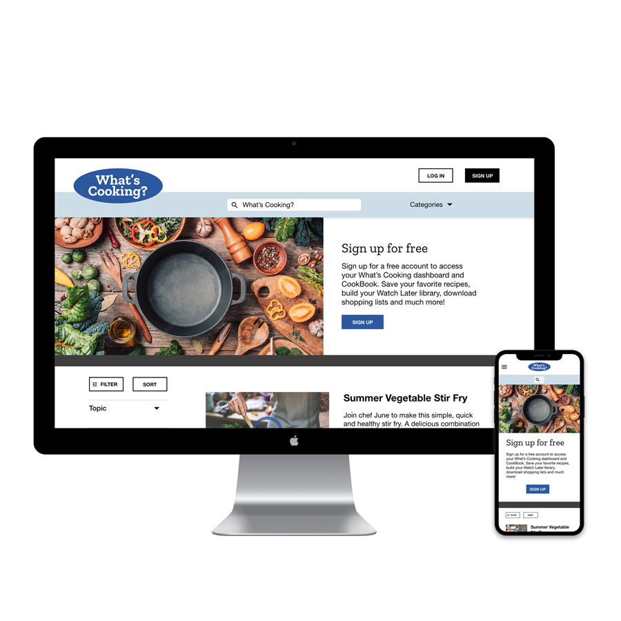
Mockups
Based on insights from the usability study that the sign up prompt came up too soon in the user flow, I made sure to add information to the homepage about the benefits of signing up for an account. This will help users understand the capabilities of the site so they know what to expect.
Based on insights from the usability study and peer feedback, I made changes to improve the site’s video saving flow. One change was to use only one icon instead of two and to add a label. This allowed users to more easily understand what to do to save videos to their library.
Mockups: Original screen size
Mockups: Screen size variations
I included considerations for an additional screen size in my mockups based on my earlier wireframes. Because users view videos on a variety of devices, it’s important to optimize the browsing and viewing experience for a range of device sizes so users have the smoothest and most convenient experience possible.
High-fidelity prototype
The hi-fi prototype followed the same user flow as the lo-fi prototype and included the design changes made after the usability study.
View the What’s Cooking? High-fidelity Prototype
Accessibility Considerations
-
Visual Hierarchy
I used headings with different sized text for clear visual hierarchy
-
Landmarks
I used landmarks to help users navigate the site, including those who rely on assistive technologies
-
Alt Text
I designed the site with alt text available on each page for screen reader access
Takeaways
Impact:
Our target users shared that the design was intuitive to navigate through, engaging because of the imagery, and demonstrated a clear visual hierarchy.
What I learned:
I learned that even a small design change can have a huge impact on the user experience. The most important takeaway for me is to always focus on the real needs of the user when coming up with design ideas and solutions.
Next Steps
-
1.
Conduct follow-up usability testing on the new website
-
2.
Identify any additional areas of need and ideate on new features