Pathway
LOGO & BRANDING
CLIENT: Journey Community Church
ROLE: Art direction, graphic design, production
Create a logo and visual identity for an initiative to engage church attendees to learn more by taking classes and workshops. The path needed to be a visual representation of steps a person could take, but it needed to be non-linear. In other words, there are different entry points and various ways to move along the path.
Solution
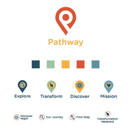
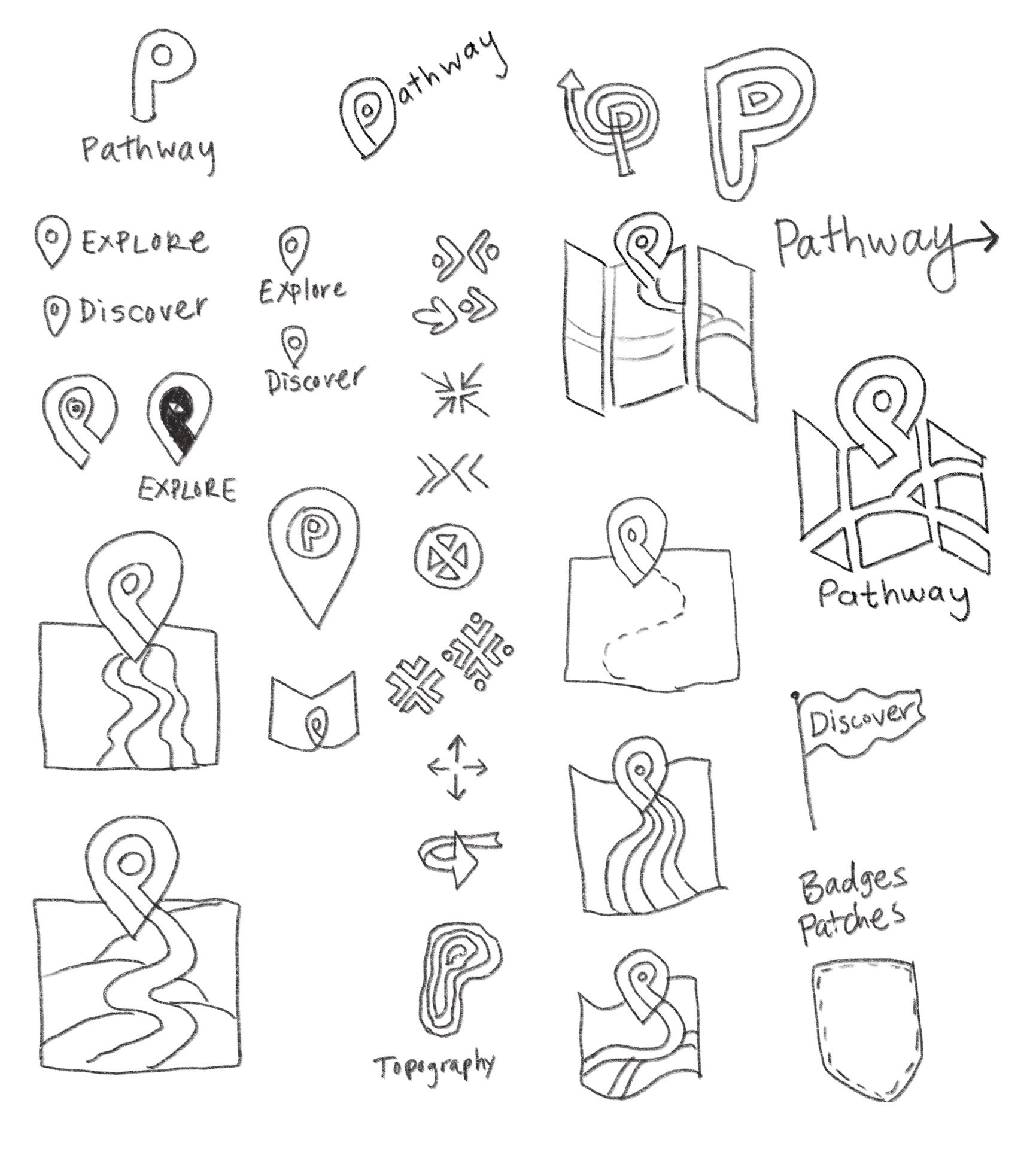
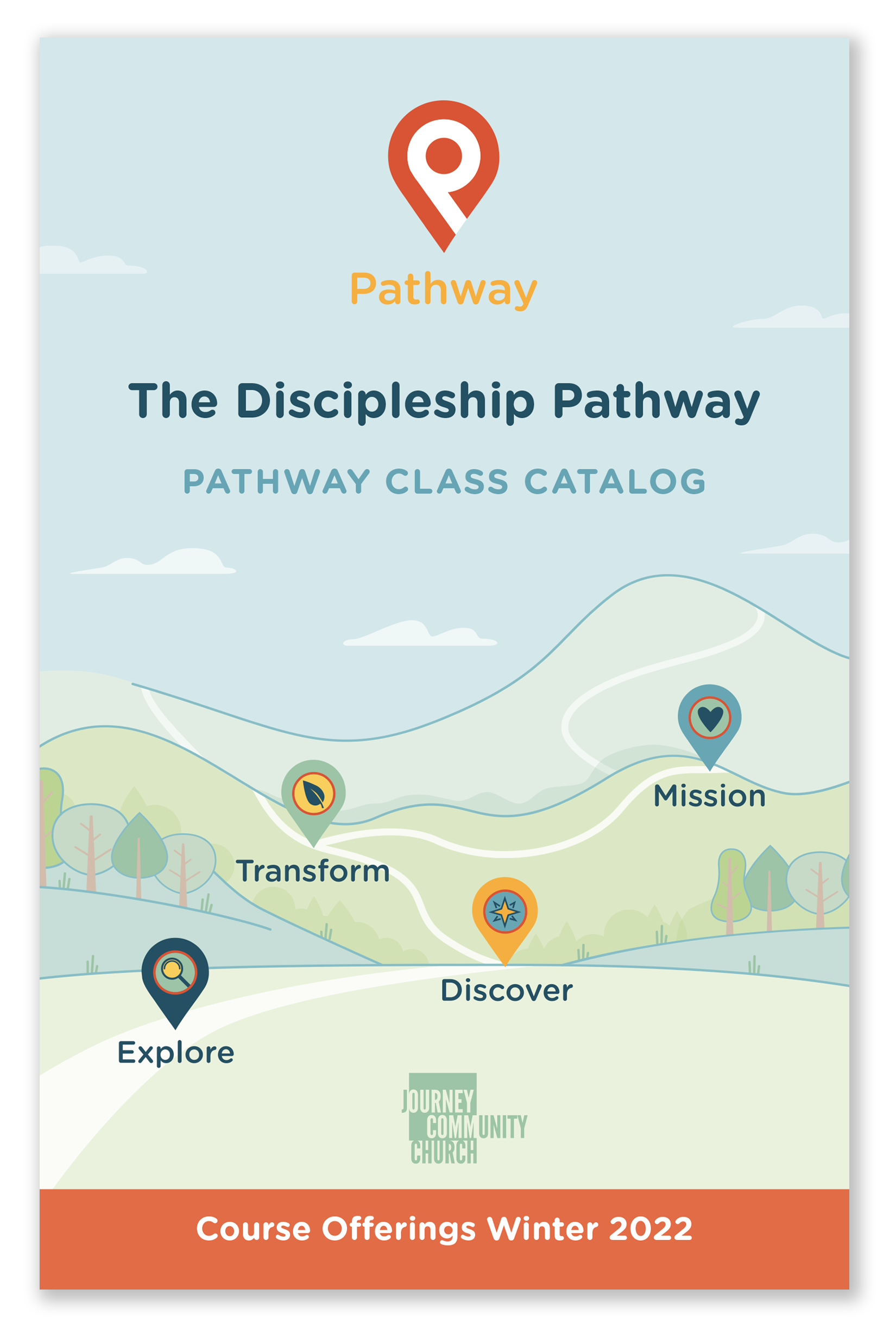
The initial ideation involved several different stake holders. The trail or map theme was chosen as a launching point. The main visual for the initiative featured hills, pathways and different icons to indicate the stopping points (locations) along the way.
Process
My process included ideating further on the map theme and developing a main logo as well as icons for the various “steps.” This included selecting a visual system with color palette and typefaces.
Results
After the logo and icons were developed, the Pathway card was created as a way to visually describe the steps and included a repositionable sticker so users could chart their progress. Since the identity system is expandable, the main graphic informed the look for additional deliverables.

Sticker
Deliverables: logos, branding, icons, color palette, assets for web and print including card with repositionable sticker, flyers, syllabus covers, signage, presentation graphics templates

Pathway Card

Syllabus Cover
Webpage Design